Data visualisation: A beautiful and powerful communication tool. An interview with Hans Hack
Hans Hack is a self-taught web developer, datavisualiser, mapmaker, artist and tool builder working as a freelance in Berlin. Waiting to meet him personally at the Space4Culture conference in Matera, we asked him to tell us about his work and his uses of satellite imagery.
Q: You have a background in Heritage Conservation. How did you become interested in data visualisation and maps?
H: As I was studying heritage conservation, I realised that presenting data on maps is a quite powerful way to communicate on research findings to the general public. Hence, I decided to learn about programming and data visualisation. Since then, I worked for museums, foundations, newspapers, NGO’S, graphic design studios, and artists. My works can be found on the web, on newspapers, at exhibitions and conferences, (like the map that I am creating for the Space4Culture conference that will be held in Matera in October 2018).
Q: Arts and technology are often seen as antithetical. Can you give us some examples of how you combine them to create your maps?
H: My main tools are Javascript, databases, open source GIS resources and image editing programs. I combine these to visualise or analyse data and to present them in creative ways. Sometimes I create my maps on request, like the map I did for the Berliner Morgenpost, showing Trump’s planned wall between Mexico and the US, as if it were in Europe, i.e. a long red line crossing the continent from the North to the Black Seas. Other times, I imagine my projects following my inspiration only. What is important to me is to use technology to sensitise people on issues that I believe are relevant to understand today’s world.
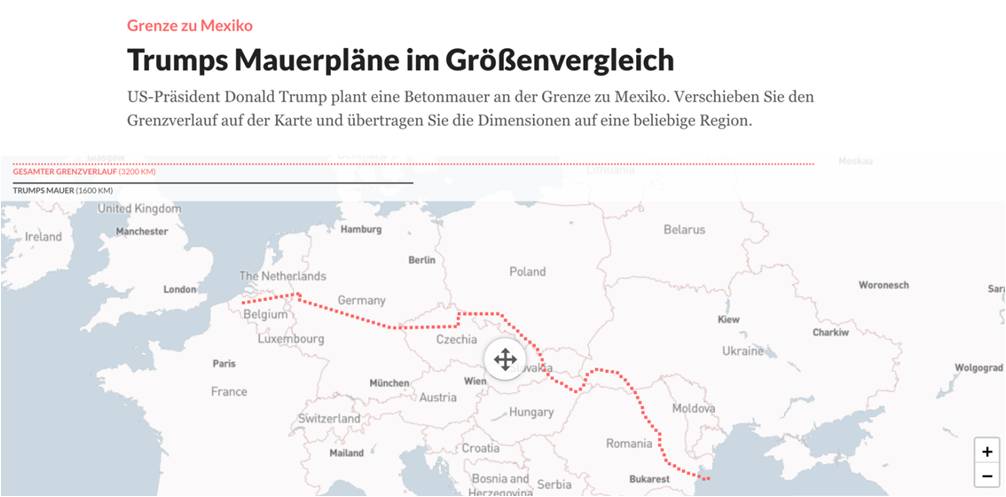
Trump’s planned wall between Mexico and the US in 2016, as if it were in Europe, for Berliner Morgenpost.
Q: Maps can rely on many data sources. In several of your projects you use images taken from Google Maps as a first layer, while in others you rely on aerial images. Can you give us some examples of use of satellite imagery to perform your work?
H: The Alpen project is quite a fun one. Here, I took satellite images of cities that are mainly flat, as Berlin, London, Hamburg, and Brussels, and then modified them in order to exaggerate their heights. In these 3D city maps, all elevation data has been hugely increased in scale to give the users a perception of how their cities would look like if their heights were hills or mountains. For example, in London, the gentle heights of Hampstead Heath and Greenwich Park become massive peaks, while the River Thames flows though a valley surrounded by hills.
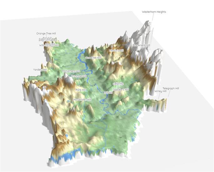
An exaggerated view of London heights. Visit the interactive map to see more cities.
Q: Data visualisaton is not only beautiful, but can also be a remarkable communication tool. You clearly showed it in some of your socially-engaged projects. Can you tell us about one that relied on satellite images to communicate about a socially-relevant theme?
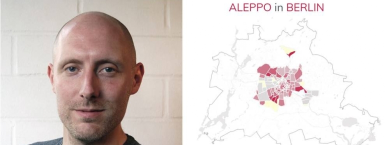
H: In March 2017, I reprojected Aleppo’s destruction onto Berlin and London. The project is called Reprojected Destruction and got quite a lot of visibility. I got inspired by a satellite-based map published by the Operational Satellite Applications Programme (UNOSAT) of the United Nations Institute for Training and Research (UNITAR). The map is based on satellite images of Aleppo taken from November 2010 to September 2016 and illustrates the percentage of buildings damaged in the city since the start of the Syrian war, more than 40%, for a total of 33.521 structures. Despite the figures are shocking, it was hard for someone like me, who has never visited Aleppo, to conceive the scale of the destruction that had affected the city.
I took some of the data made available on this map and reprojected them onto figure-ground maps of Berlin and London. As a geographical reference point, I superposed the Citadel of Aleppo on that of the Museum Island in Berlin and of the Tower of London. I then indicated the reprojected destruction by marking in red some randomly selected buildings. To make it more representative, I also mapped the distribution of the reprojected destruction with respect to Aleppo’s administrative borders as provided by the United Nations Office for the Coordination of Humanitarian Affairs (OCHA). In the London map, the Tower of London, the City Hall, the Palace of Westminster, Buckingham Palace, the Olympic Stadium, King’s Cross station and Tate Modern have been razed, while Camden, Islington, Dalston and Hampstead are decimated.
The overall aim of the interactive map is to help western cybernauts to imagine the extent of the destruction affecting Aleppo in an environment they are familiar with.
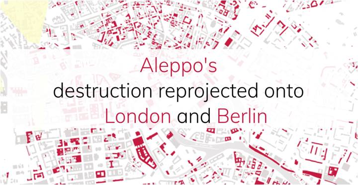
Visit the interactive map to see Aleppo’s reprojected destruction on London and Berlin.
Q: What are the main challenges for you to use satellite imagery?
H: The main obstacle for me is to find reliable and free-of-charge data sources. I would love to get in touch with the space community to better understand what satellite-based data is out there and how to access it. I believe that other data visualisers and artists would also be interested.
Q: What are your plans for the future?
H: To continue experimenting with data visualisation on maps, for sure, but also to start working with machine learning Also I would like to explore more the possibilities to work with satellite images and explore the tools and the data that is out there. I am constantly looking for new ideas to challenge the perception we have of our environments and to recontextualise the reality we live in.
Find Hans Hack’s portfolio at hanshack.com